


Nicola and the art of abundance
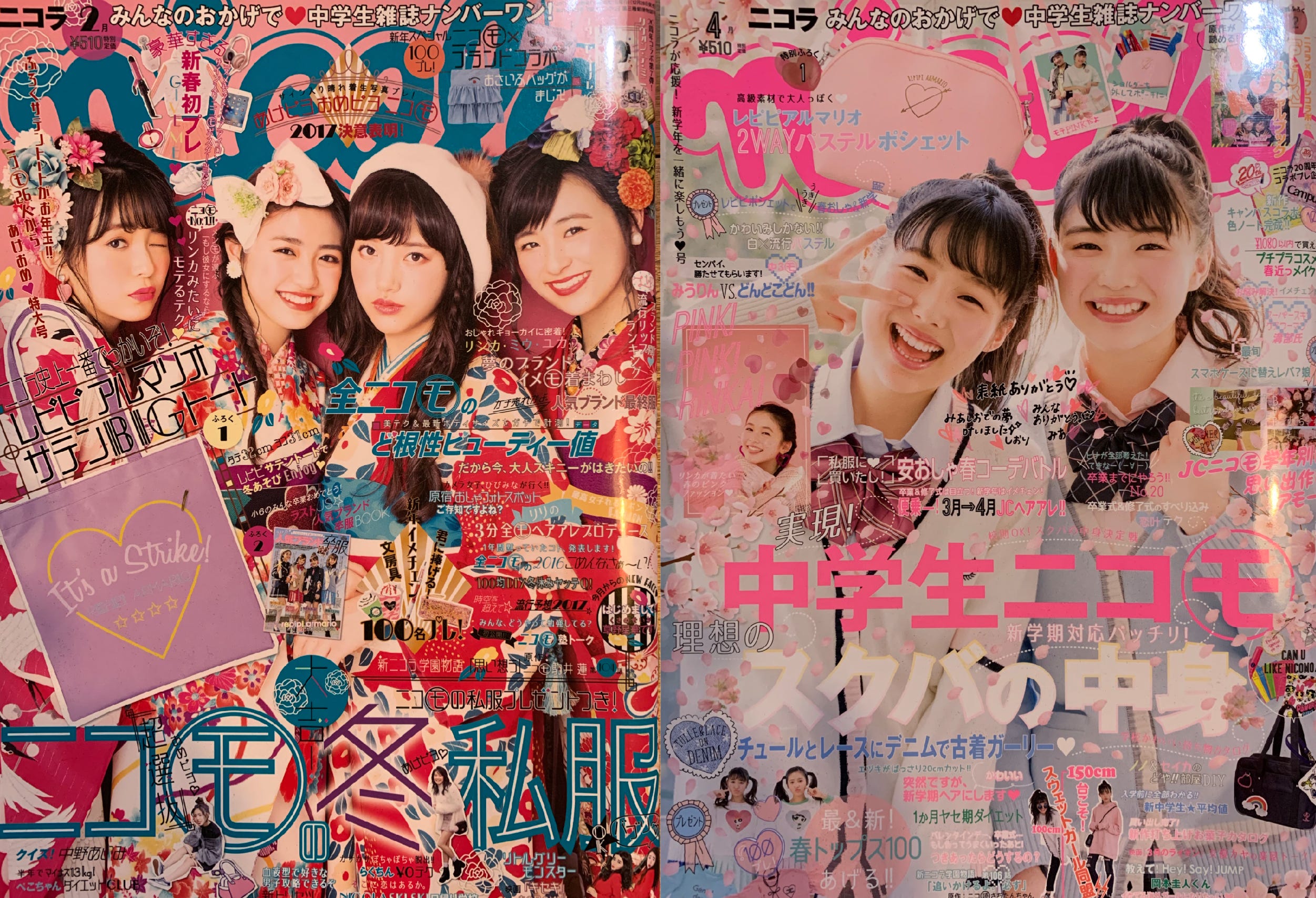
There is a Japanese magazine for girls called Nicola. I stumbled across it years back when I was looking for images of Tiger Beat, the teen magazine that I remember from the 70s, as an example of design chaos. Tiger Beat might as well have been designed by Joseph Muller Brockmann compared to Nicola.
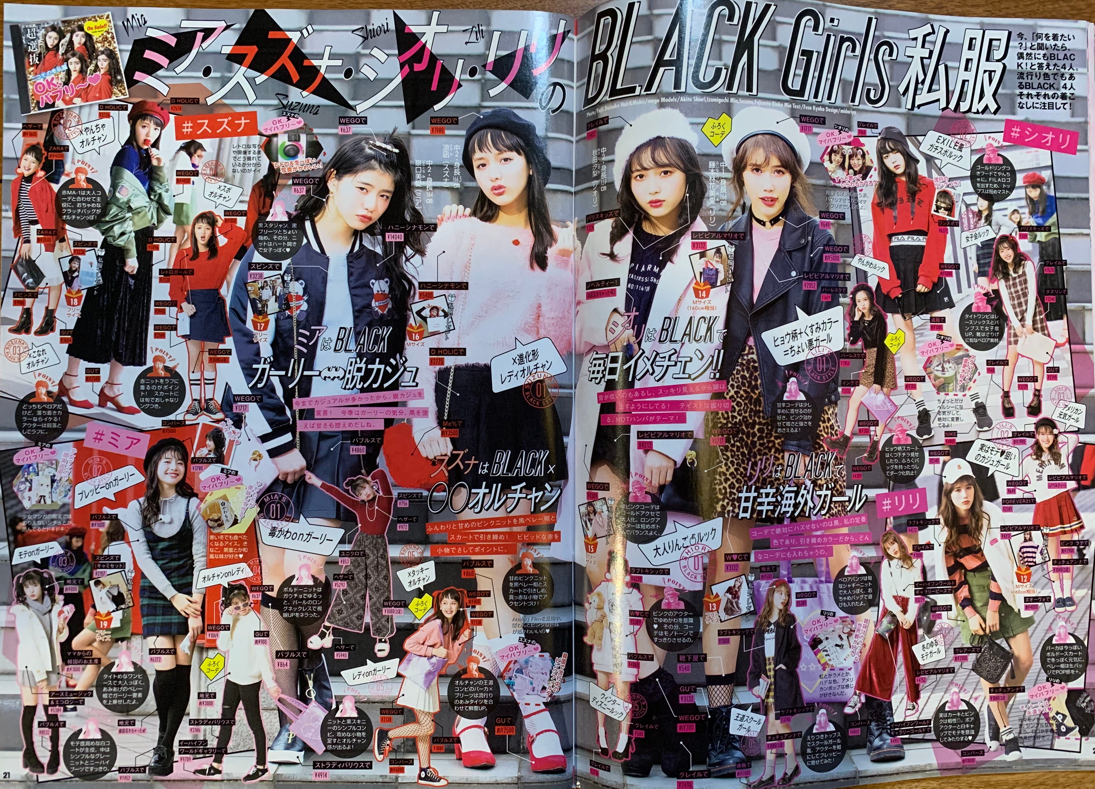
The covers are piled so high with lettering and hearts and insets and flowers and ribbons and cute characters that it extends up over the magazine title. You have to know what it is to know what it is.
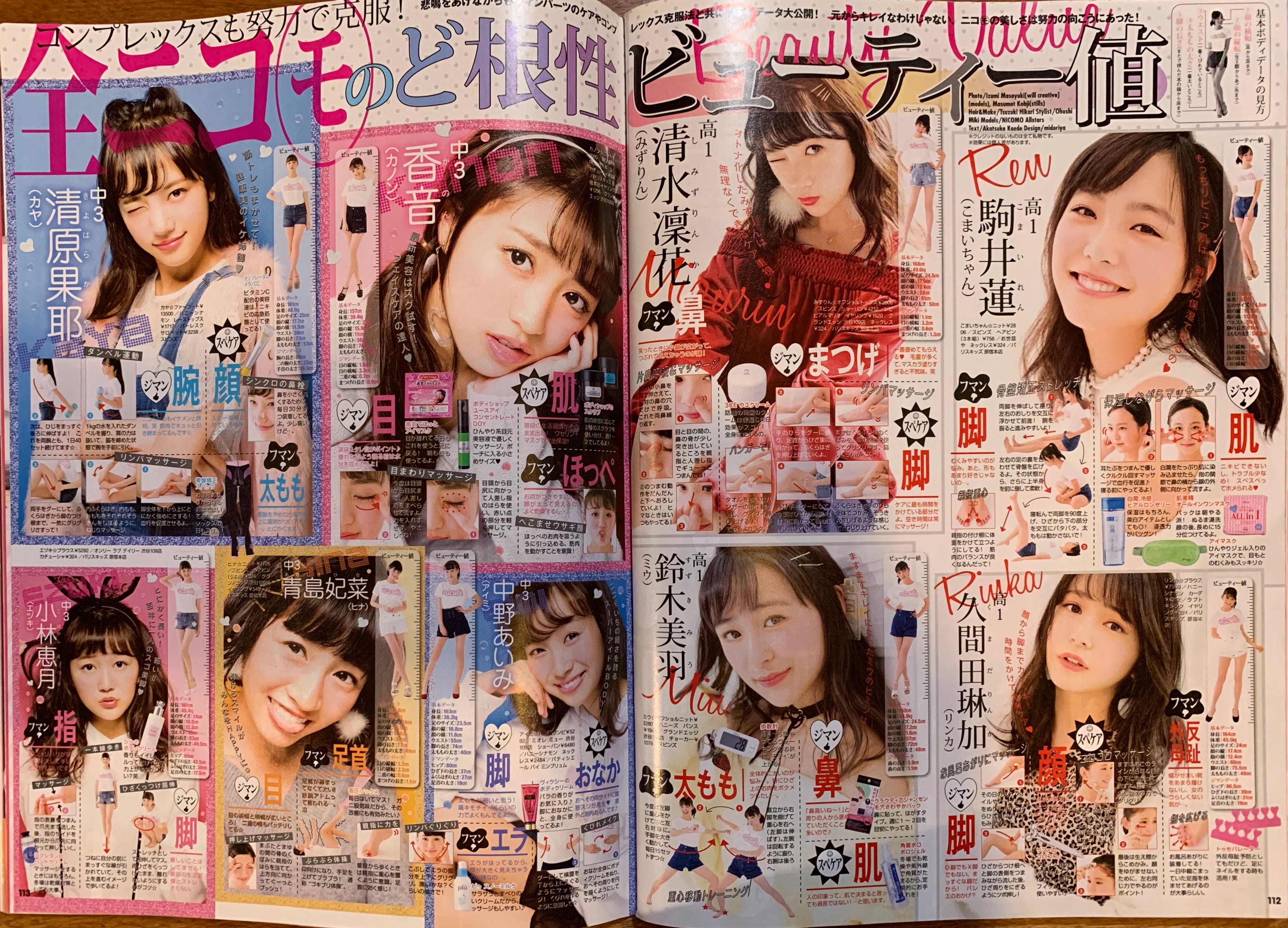
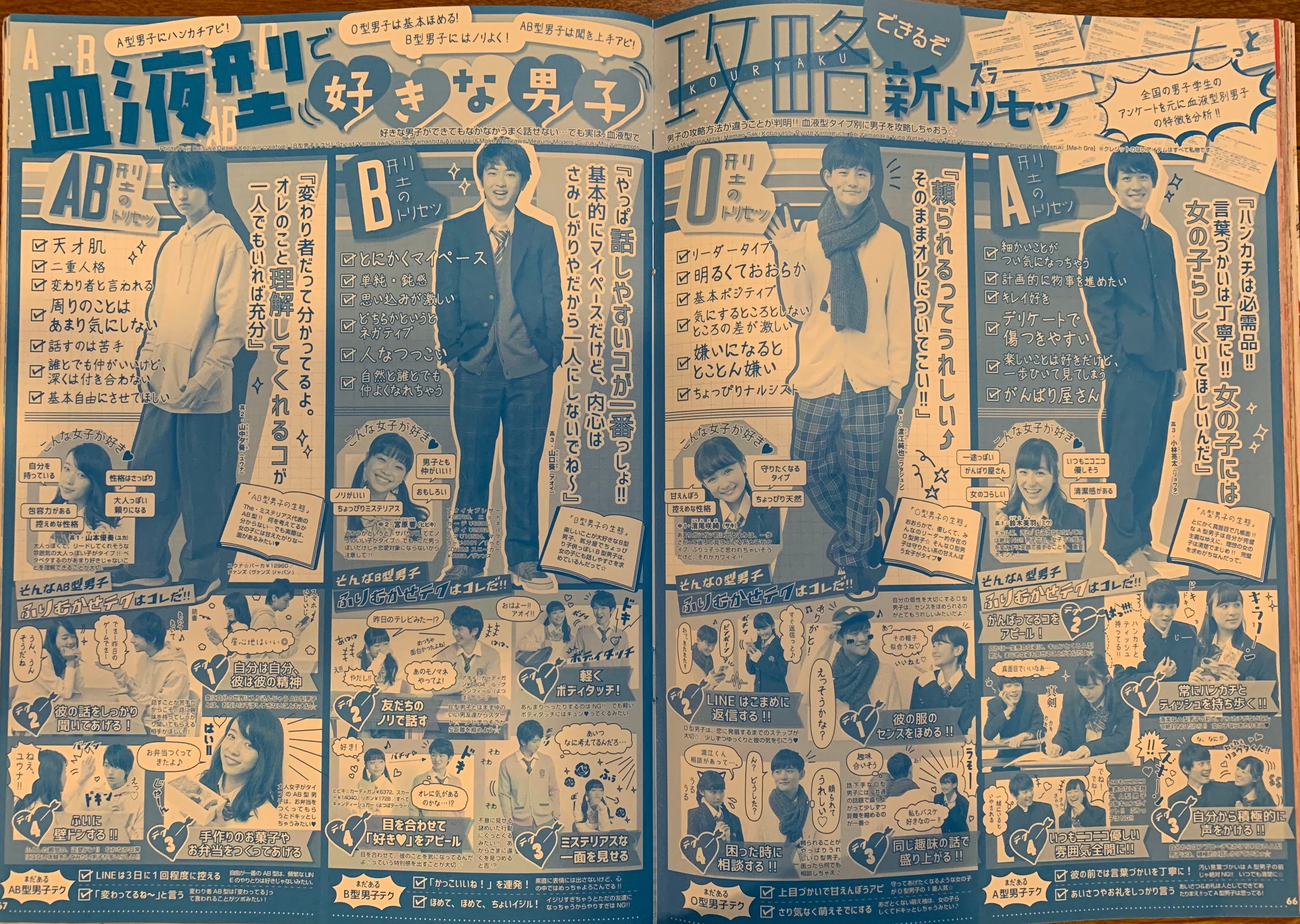
Incredibly, the madness continues inside and throughout the magazine. Every page has layer upon layer of patterns, shapes kanji, english and photos in a myriad of styles and sizes.
And if you think I’m going to lament this as an abomination of design, you don’t know me.
It is gorgeous!
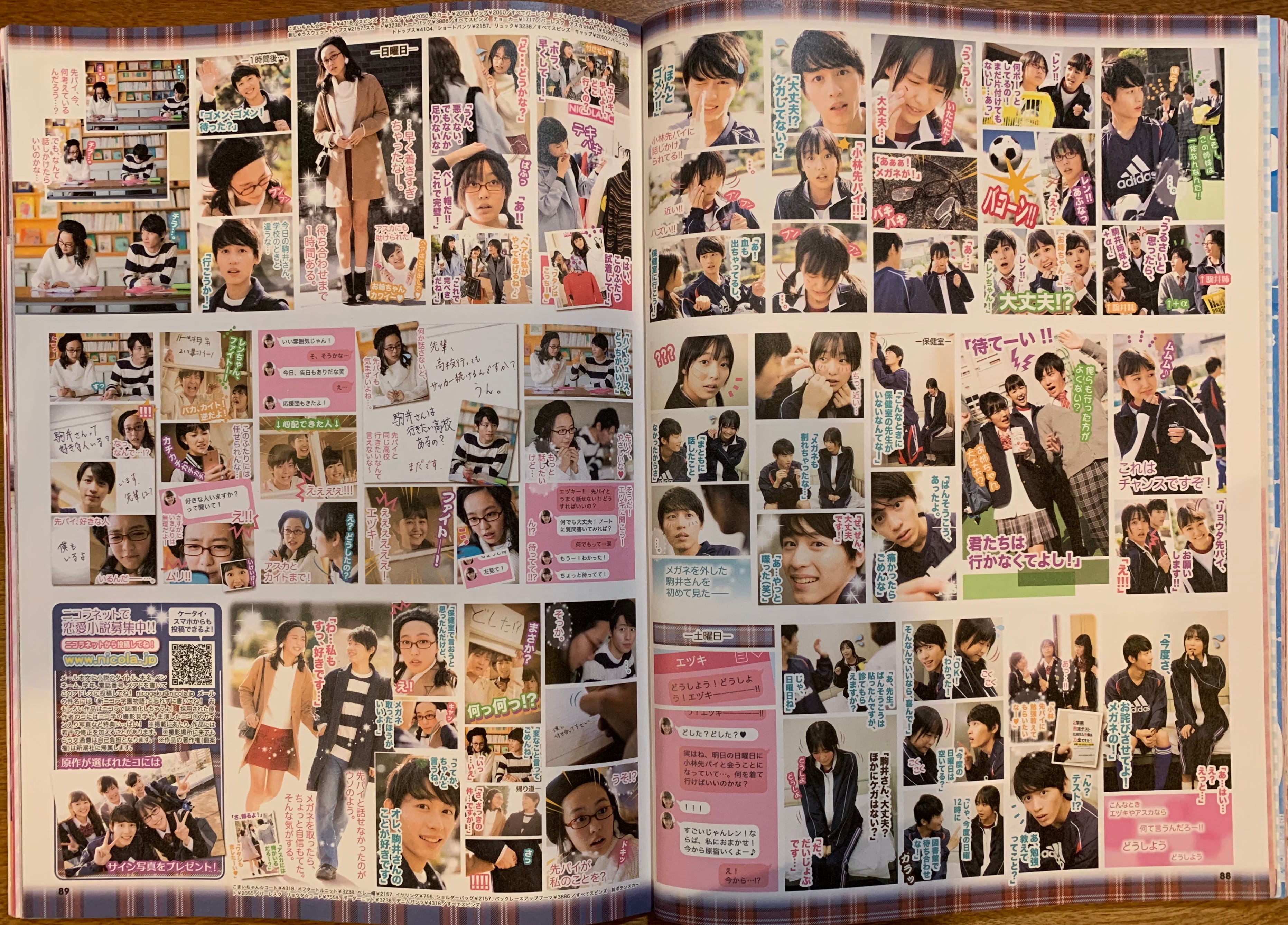
Boys appear seemingly only as objects of fantasy, laid out in manga-style stories.
Inside the magazine is an uncoated paper insert, chopped down and printed 1 colour with more boy profiles, horoscopes, lists and more.
What I find particularly interesting about this aesthetic, is how completely incapable most North American designers would be of accomplishing this. Every ounce of their training is to not do this: to pare back, be spare and simple. Most are tortured when or if they have to work on a regular trade magazine, with all of its inserts, sidebars and asides that attempt to make it look exciting while pandering to short attention spans. To go further—further yet—far over the line of design decency and common sense, is something they are just not capable of. And I think it’s a pity.
Of course the whole world can’t and shouldn’t look like this, but neither should it look like the sameness of “clean and simple,” as it often does.
Designers are trained to be inflexible; to follow a prescribed path. They love and hate—which is fine, but they love and hate the same things, looking to each other for guidance and “inspiration” (don’t get me started).
Design and design education should be a process of exploration across cultures and time. Steal this, steal that, mash them together see what happens. What is bad taste and can it be used inventively? What is good taste and can it be subverted? People often ask me where I get my ideas from, and my answer is always “everywhere.” Difference is good. Madness is good. What you think of as bad is often good. Give Joseph Muller Brockmann kittens—see what happens.
Not just teen magazines. I have some Japanese travel mooks (magazine-books) with the same style.
I love this. So smart.