I was alerted to a recent design melt-down on Instagram, wherein Stefan Sagmeister posted an image of a flag (above) created by Italian designer Tomaso Marcollo, as part of his long running series of mini design critiques of work people send him.
First, for anyone who doesn’t know, Stefan is one of the most influencial designers of the past 30 years, and certainly the most famous worldwide. Second, instead of using his Instagram platform for endless self-promotion, Stefan uses more than half of it for a free mini critique of work that people send to him for that purpose. This he does, presumably, out of the goodness of his own heart. Some of the work he’s sent is shit—but he never says “it’s shit.” While his couple of lines of comment are often critical, he is gentle with this criticism and usually tries to find *something* nice to say to these people who are often students or just-starting designers. Third, Stefan is a good friend of mine—which doesn’t mean I agree with everything he says or does (we have our good-natured quibbles)—but I know he’s a kind and very smart person. Here was his response to the flag:
When I saw it I thought it was a boring idea, and technically, I would have pointed out the trouble spot where the lines cross the leaf at the crotches of the left and right leaf lobes, causing tiny white nipples along the line.
But what were other people saying? What was the foofaraw?
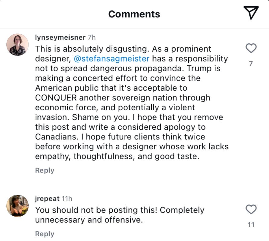
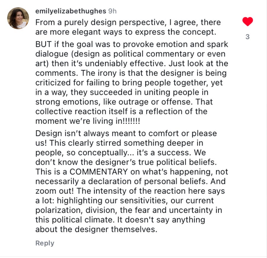
Hate, violence, fascism, offensive, dangerous … just pull out every hysterical, overblown, narrow-minded reaction you can think of, and it was said. Some people said Stefan never should have posted it; some thought Stefan had designed it (as if!! ); most thought it favourably promoted the US taking over Canada. Huh??
I had immediately assumed it was a student or young designer, exploring the idea of “what if…?” I’m a Canadian who detests Mad King Donny, the current Dear Leader of the US, and I’m overjoyed with Canada’s overwhelming response to boycott everything they can from the US. But this … offensive? Not in the least.
I’ve seen this off-the-rails overreaction to so many other things in the past five years—people who a) see only one narrow thing in everything they encounter and b) become so incensed by it that they fully believe they/their tribe are somehow under attack, being hurt, assaulted, damaged, that their very existence is being threatened! This time by a boring little design concept on Instagram.
The RGD (Ontario-based “Registered Designers of Canada”) thinks this little concept denies Canada’s identity and existence ! And before it, that old trope, “the wrong side of history.” Oh my god, if this is all it takes to conquer Canada, we are in serious shit.
Did anyone even look at Tomasso Marcola’s other work? I did. Here’s a couple of others from his Instagram:
The US flag with ex-Twitter brand-X in place of the stars. Hmmm, what hateful message must it contain? The German flag with a big white stripe added to the red, black and yellow, with the biggest stripes being red, white and black. What could that mean? OH MY GOD, HE’S A NAZI!!! KILL HIM!
I would go so far to say that every outraged comment on Stefan’s post indicates the thinking of a bad designer. Designers should be able to work with symbols to make points that are at times ironic, critical or even satirical. They should be able to see and express nuance. They should be able to constructively critique work. They should be able to point out visuals that they find “problematic” in a rational way. One of design’s great dreads (and jokes) is the unintended penis (or swastika) in a design. It happens all the time, but the answer is not to fly off the handle accusing people of being paedophiles or nazis and demanding apologies.
And what’s incredibly weird is that a ton of vitriol falls upon Stefan for even daring to show this “dangerous, offensive” image. Stefan, who, remember, uses his platform to show the work of little, unknown designers who just want his opinion on something they made.
Note, “It’s like a Nazi flag covering the entire Europe during WWII.” I’m pretty sure I’ve seen that image more than once from Britain and the US during the time to depict the threat of the Nazi war machine—not as a promotion of it.
This kind of insanity has got to stop: seeing hate everywhere, reacting to things you don’t like as if you’re being attacked and equating them to the worst kind of actual violence. And worse, thinking that other people’s ideas have the power to erase your existence, and that seeing something like a sign, or drawing is irreparably harmful. (Part of the problem here is designers’ hubristic idea that design is “powerful” 🙄).
If I were Stefan, would I have posted this? Yes. And my mini-critique would be “I’m unclear whether this is meant as a warning against (protest) or a depiction of the imagined US takeover of Canada (editorial), but as either, I would encourage you to think beyond “thing 1 + thing 2”, and try to find a more interesting, clever way to express your idea.”
At least one person still has a brain (looking for a Canadian designer? Hire her):


Marian,
The responses to Sagmeister’s display of the flag mash-up remind me why I don’t bother with graphic designers’ discussions. It’s hard to comment on the reactions to the image without sounding like I’m screaming, “You kids get off my lawn!” I am impressed, though, that it was possible for something to lower my opinion of the RGD.
In 1970, I was hitchhiking across the US and Canada. A bunch of Canadians asked me whether the rumors were true that Canada was about to legalize marijuana and that Richard Nixon had given orders to send tanks across the border in response.
Your formal comments were the start of a possible interesting discussion: Could you do something worthwhile with the nipples? How about the top of the leaf turning into a crown? Is the whole thing wanting to become the Starbucks mark? (Does the stem really want to be an anemic exclamation point?) . . .
. . . Am I the only one weirded out by having fifteen stripes? What does **that* mean?
Thanks for a demonstration of how graphic design needs a critical literature—but can’t bothered to support it. Sorry, Marian, but you’ve misdiagnosed the problem. Stefan brought this upon himself by offering these “mini-crits.” They aren’t crits. At best, they’re notions. Everything you wrote is spot on and shows the necessity of having a nuanced, expansive take on a design topic—as opposed to a few terse sentences. Then you can pop off in response. But as the political maxim goes, if you’re explaining, you’re losing. In this case, it’s you reinforcing the idea that a few choice words from a design hero is a sufficient mode of evaluation. It’s not the reader’s fault that they couldn’t intuit all the issues you bring out from Stefan’s three sentences. The problem isn’t designers being “crazy” it’s being lazy—in how they examine design work and eschewing taking in a lengthier study. Maybe if a true design criticism was prevalent and respected, we wouldn’t have these flash mobs of fury. (That “maybe” is admittedly doing a lot of work.) Full disclosure: I actually encourage my students to submit work to Stefan. It’s a challenge for them to think outside the classroom and be part of the wider world of design. And what’s to lose? I suppose I’m undermining my own assertions here. And here, where I write about Stefan’s Instagram: https://scratchingthesurface.fm/stories/safe-words. I’m at peace with the knowledge thousands more designers will read short Sagmeisters than that article I just linked to. But if you come at me for it, you’ll have earned it.