I am not, as a rule, particularly fond of the word “branding”. For the approximately three readers of mine who are not in the graphic design industry, let me explain.
Branding is ubiquitous in modern life: corporations, home businesses, education, government departments, regional and national areas, political and social movements are all “branded”, as are some individuals. The process encompasses a few stages of the development of an identity. Broadly speaking:
The first stage is the definition of “self”: what is it, what does it do, what are its attributes that differentiate it from everything else in a) the world and b) similar or identical industries.
Next is the development of a graphic “identity”: from a logo at the most basic, to a “style”, using design, fonts, etc. to reinforce the differentiation of “self” and the development of necessary materials (a card, a sign, a website, etc.).
Depending on the entity, this can spread to an entire graphic look: for instance packaging, sub-brands under an umbrella brand, a colour palette, photography or illustration style etc. that goes beyond the logo and main identity to further differentiate the “self” from “others”, which often pairs with advertising to disseminate the “brand”.
And then there is the “ethos”, “what the brand stands for”, the gobbledygook, the dissemination of said ethos as “brand values”, and the selling of it as “culture”. Smaller companies or organizations try for this (my previous post highlights one such nauseating example); larger ones often succeed (Nike, Coca-Cola, Yale, Prince …)
It is that fourth stage I find particularly insidious. However, this post is more about the second and third stage.
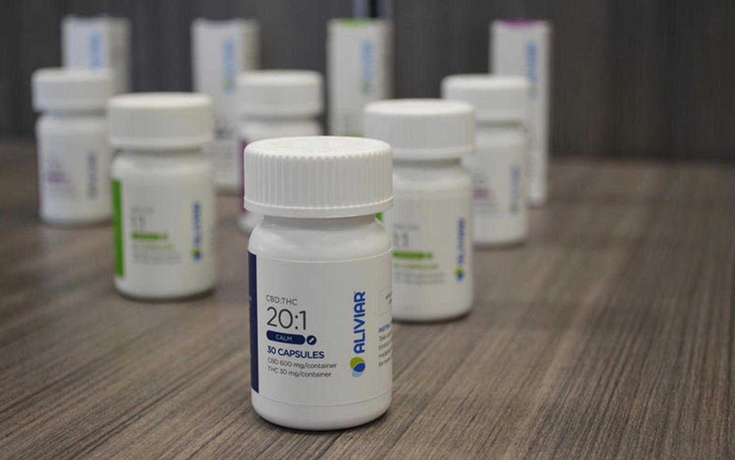
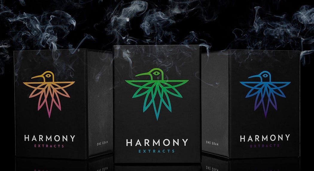
Marijuana (as a recreational drug) became legal in Canada in 2018. For the past couple of years we’ve had a private outlet on Bowen Island selling cannabis products, and over a year ago I stepped in to check it out. The branding of marijuana in the States where it is legal in the US has leaned heavily, and disappointingly toward the “clean, simple” aesthetic that has cursed the western world for many decades, with an emphasis on a vaguely “medicinal” or “good for you” appearance. Wired magazine even described the Pentagram-designed products for Snoop Dogg’s marijuana brand as appearing like artisanal candles or chocolates.
Canada, on the other hand has taken an, erm, regulatory approach. Undoubtedly spurred by Canada’s government-warning approach to cigarette packaging—which started by covering most of the package with warning labels, followed by adding large, almost hilariously gruesome photos of damaged body parts, and has recently additionally removed all brand logos or identifying marks other than the name (not the logo) of the brand—the Canadian government has taken a preemptive strike on cannabis products by making all packaging the same, with a stop-sign + marijuana-leaf icon at top left; small, uniformly typeset ingredients label (incl. THC/CBD content); yellow warning label below; and top right (usually), a small, white logo of the brand.
So, I’m anti-branding as a hyped-up inducement to religious fervour as an aid to commerce, especially as a commodified “culture,” but I’m very much in favour of branding as the identification of separate manufacturers of similar products. I’m not a huge dope fiend, but from time-to-time I do enjoy getting a little high from edibles, particularly gummies. Through a process of hit-and-miss, I have discovered that the Foray peach/mango gummies (pictured at top left) are brilliant: a pack is about $7, containing 2 gummies, each with 5mg CBD and 5mg THC which is enough to get pleasantly high for 2-3 hours (for myself and a considerably larger friend). That’s a $3.50 evening of giggles and entrancement!
Theoretically, all 5mg THC + 5mg CBD products should be the same, but weirdly, they’re not. After using my favoured product, it took me ages find it a second time. My ability to remember the name of an unfamiliar company without the aid of colour and design has proved very difficult, and given that not all products are available at all times, finding the one I like has been a crap shoot. Was it peach-mango or grapefruit-orange or very-berry? Was it 10mg THC? Did it include CBD? If so how much? What was it called again? All I can see is a sea of identical packaging with ten brand names neither I nor the shop keeper can remember. When I did stumble on the right one, taking a photo of it seems to be the only way to correctly remember it for next time.
Imagine if you had to buy soap this way? Or food?
So “branding”. OK. Allright. I get it. Useful; necessary even. Just spare us the gobbledygook OK?


